
[Updated below 8/12/15] It’s well known that architects are trained to write and speak using a specialized vocabulary, one that is intended to help them “express” their design intentions without actually developing a coherent argument. The Urban Dictionary puts it this way (defining what they call archispeak):
Large, made-up words that architects and designers use to make themselves sound smarter than you (you being the client or the confused observer of design). It does nothing to inform or enlighten the consumer of architecture and mostly serves to numb them into obedience or self doubt.
Being well acquainted with this phenomenon, I’m aware that exposing such absurdities will have little or no impact on the development of a particular project: as the Urban Dictionary suggests, the clients have already been numbed into obedience. And when the clients themselves are architects, as in this case, it’s likely that they come to the project already pre-numbed. Still, even if only to amuse myself, I’ve looked through the “Site Narrative” prepared by AAP alumnus Wolfgang Tschapeller for a Fine Arts Library in Rand Hall at Cornell University and made the following page-by-page notes:
Cover. “Rather than acting as a physical symbol, it radiates activity and occupation.”
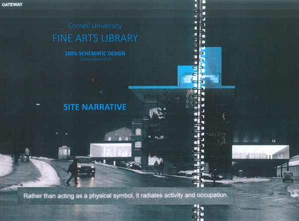
Fig. 1 Site Narrative dated 2 December 2014. Image has been cropped to reduce size and some text has been enlarged for clarity
This is metaphor masquerading as reason. What does radiating activity actually mean? That when one looks at the physical object, one imagines some sort of activity happening inside? Is this because there are windows in the building and one can look inside and see “activity,” or because—unlike ordinary buildings with windows—some mysterious and undefined architectural sensibility is at work here which causes otherwise distracted students, staff, faculty, and visitors to gasp in awe, their once banal and humdrum existence now transformed by the knowledge that “activity and occupation” are radiating from this object?
Page 1. “The perimeter of the Arts Quad is clearly defined, with Rand Hall being the single exception that protrudes outwards at the Northern termination point of East Avenue.”
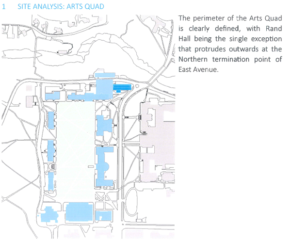
Fig. 2 Site Analysis Arts Quad. Plan has been moved under title and cropped to reduce size and some text has been enlarged for clarity
Well, if you highlight Rand Hall by giving it a dark blue tone, and fade out all the other protruding objects, maybe no one will notice that the perimeter of the Arts Quad is actually defined by protrusions, whether created by the buildings themselves (e.g., the wings of Goldwin Smith Hall), additions to those buildings (e.g., the back of Lincoln Hall or—dare we mention it—Milstein Hall), or new buildings (e.g., the Johnson Museum). What is also not mentioned is that Rand Hall, rather than being an anomalous creation, was once part of a larger grouping of informal and industrial structures (including the Foundry just north of Milstein Hall) that, as late as 1951, defined a zone of structures to the north and west of the current arts quad perimeter.
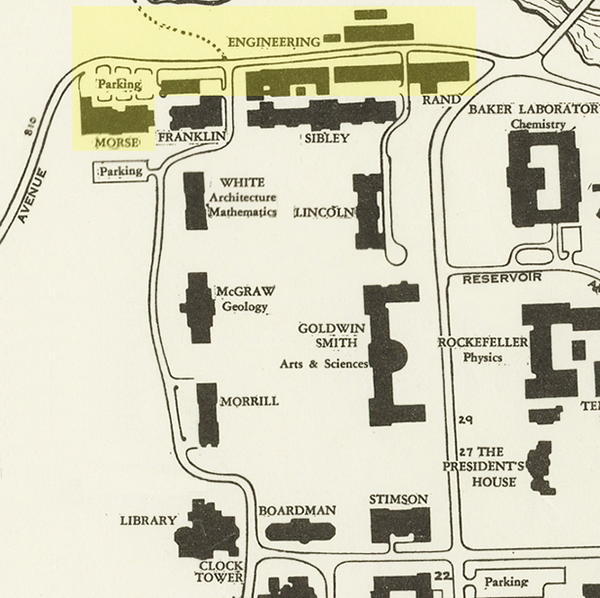
Fig. 3 The Campus of Cornell University, Ithaca, NY, 1951 (yellow highlighted region shows industrial-type structures)
Page 2. This page makes the case that Rand Hall, occupying a unique spot both at the “gateway” to the main campus from North Campus, and at the end of the East Avenue axis, should have a more explicit marker (“superstructure” or “lantern”) to denote its importance or significance.
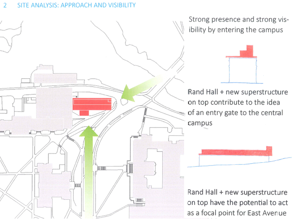
Fig. 4 Site Analysis: Approach and Visibility. Image has been cropped to reduce size and some text has been enlarged for clarity
There’s nothing particularly wrong with that general proposition, but nothing particularly right about it either. I’m not a fan of symbolic speech in any of its forms (whether spoken or visual), especially when taken seriously. The purpose of the Rand Hall “marker” has this in common with the purpose of many other historic markers: to call attention to the wealth, power, or taste of a particular entity, in this case the College of Architecture, Art, and Planning and the University as a whole.
Page 3. Here we have a further defense of “symbolic speech,” with the architect providing his own critical appraisal (“another piece of contemporary architecture of high quality”).
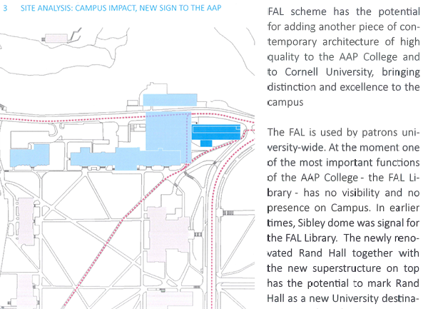
Fig. 5 Site Analysis: Campus Impact, New Sign to the AAP. Image has been cropped to reduce size and some text has been enlarged for clarity
The idea that important spaces need symbolic expression (“…one of the most important functions of the AAP College – the FAL Library – has no visibility and no presence on Campus”) is absurd. A prime counterexample is M.I.T.’s legendary Building 20, a place known for innovation and important theoretical discoveries, that consisted of “a temporary wooden structure hastily erected during World War II on the central campus…” (torn down in 1998 and replaced with Frank Gehry’s Stata center).
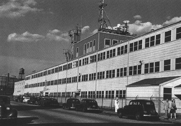
Fig. 6 Building 20 at M.I.T., a classic “low-value” building
This building served its purpose quite well without any added symbolic architectural gestures to express its significance. It also embodies the wisdom espoused by Jane Jacobs (see Chapter 10 of The Death and Life of Great American Cities) regarding the value of old, “low-value” buildings: “Old ideas can sometimes use new buildings. New ideas must use old buildings.” Rand Hall, as an old, adaptable, flexible, industrial structure, served that purpose admirably over the years: starting in the early 1970s, it became home to architecture design studios, the Program of Computer Graphics moved in, and then various iterations of innovative computer labs were installed on the second floor. It accommodated a small wood and metal shop, which was later enlarged to include laser cutters, 3D printers, and other advanced tools. None of this could have happened in a high-end, symbolically-loaded, and expensively-renovated building. Like Milstein Hall, the proposed design for Rand Hall will hinder, if not destroy, any capacity to accommodate new and innovative program development.
Along these same lines, Cornell Architecture’s legendary graduate programs in Architectural Design and Urban Design (from which Wolfgang Tschapeller, the architect of this proposal, graduated in 1987) occupied classic low-value and “undesirable” basement rooms in Sibley Hall for many years. In other words, it is faculty and students who create important work and thereby define the reputation of places like Cornell, not symbolic architectural gestures.
Page 4. This image purports to distinguish between the two entrances to the Fine Arts Library, one characterized as a “public entrance” and the other “for AAP only.”

Fig. 7 Site Analysis: Entry. Image has been cropped to reduce size and some text has been enlarged for clarity
What’s peculiar about this plan diagram is the fiction that some sort of purposeful path connects the three departments of AAP (art, planning, and architecture) to the second-floor “AAP” library entrance. The yellow dotted line shown on the site plan, starting with Tjaden Hall (Art) on the left, actually crashes through a side wall of the art facility, not bothering with the formality of using an actual door, then enters into the basement of West Sibley Hall through a locked exit-only door, then presumably takes a stair or elevator to the second floor, where it moves through the Sibley Dome into E. Sibley, from which it enters Milstein Hall’s architecture studio and finds its way into the Rand Hall library. The path through Milstein Hall is not well-defined by hallways or corridors; rather, one must figure out a way to move diagonally through the orthogonal studio layout without invading the privacy of the studio classes.
In spite of all the talk about Milstein Hall being designed for the “college” and creating a “sense of connection across disciplines” (“Walkways and doorways connecting Milstein Hall to Rand and Sibley halls provide the practical advantage of moving through the college’s buildings along with promoting a sense of connection across disciplines”), it’s clear that the second floor level of Milstein Hall which connects to the proposed library in Rand Hall is an architecture-only space, making it more than a bit awkward for faculty and students from the two other departments to avail themselves of this special AAP entry.
Furthermore, if one really wanted to draw useful conclusions from an analysis of public and AAP-only entrances, it seems to make more sense to put a two-story library on the bottom two floors, corresponding to the location of both the public and AAP-only entrances, and also reinforcing the formal division of the building into a two-story “base” with a one-story “top” (Figure 7a); while putting the shop functions on the top floor allows easier access to roof-top venting (currently, the shop exhausts directly into the ground-floor covered space between Rand and Milstein Halls), although it also makes the delivery of shop material (including Dragons) a bit more difficult.
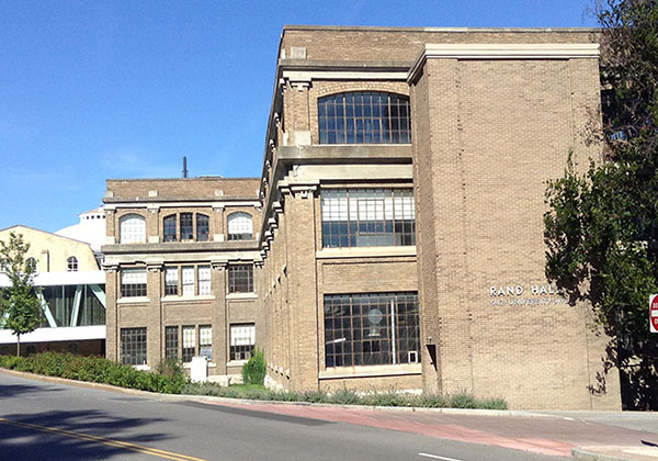
Figure 7a. The formal articulation of Rand Hall’s facades into a two-story “base” and a one-story “top” contradicts the idea of creating a double-volume space on the top two floors. (Photo by J. Ochshorn, August, 2015)
Page 5. The “articulated skyline” of Cornell is an imaginary, or abstracted, view of the campus looking west.
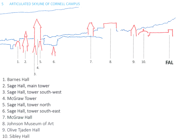
Fig. 8 Articulated Skyline of Cornell Campus. Image has been cropped to reduce size and some text has been enlarged for clarity
Mostly towers are shown (Uris clock tower, McGraw tower, etc.), but also some other things like the Johnson Museum, Sibley Dome, and, of course, the proposed Rand Hall “lantern.” There is no argument made on this page; any other intervention silhouetted into this diagrammatic landscape would have the same merit, or lack of merit. But we get it: there are lots of things that poke into the sky at Cornell. On the other hand, it is interesting to see what is left out of this diagram: the biggest and most visible “tower” seen when crossing the Thurston Avenue Bridge is neither the Sibley Dome, the Johnson Museum, nor any of the towers diagrammatically indicated; rather it is the Olin Chemistry Research Lab, presumably left out of the diagram because it just didn’t fit into the architect’s fictional narrative.
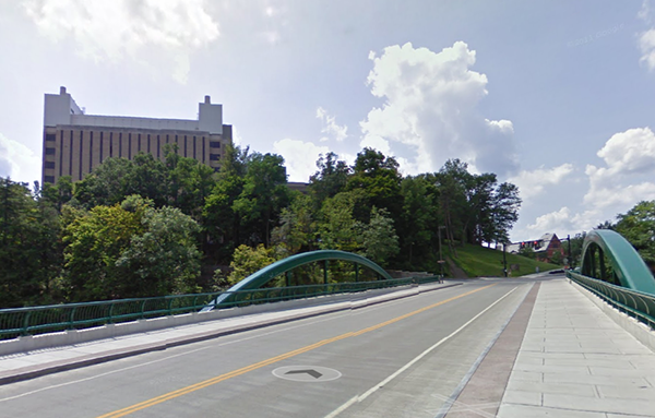
Fig. 9 Google Street View looking south from the Thurston Ave. bridge at the Olin Chemistry Research Lab (none of the architect-designed or architect-proposed “gateways” are visible)
Page 6. “Lantern as part of the new superstructure will serve both as an urban marker and a means of adequately presenting the volumes of books. Adaptive reuse of an existing university facility creates a high quality environment for one of the most important functions of the AAP College.”
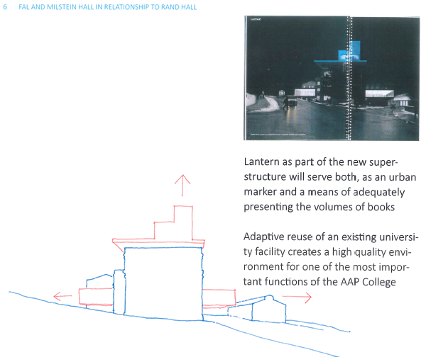
Fig. 10 FAL and Milstein Hall in Relationship to Rand Hall. Image has been cropped to reduce size and some text has been enlarged for clarity
Sorry, but how is this an “urban marker”? And in what way is this “adequately presenting the volumes of books”? I think some other, more explicit, diagram is needed to explain this drawing to us grown-ups. Like the Little Prince says: “J’ai alors dessiné l’intérieur du serpent boa, afin que les grandes personnes puissent comprendre. Elles ont toujours besoin d’explications.”
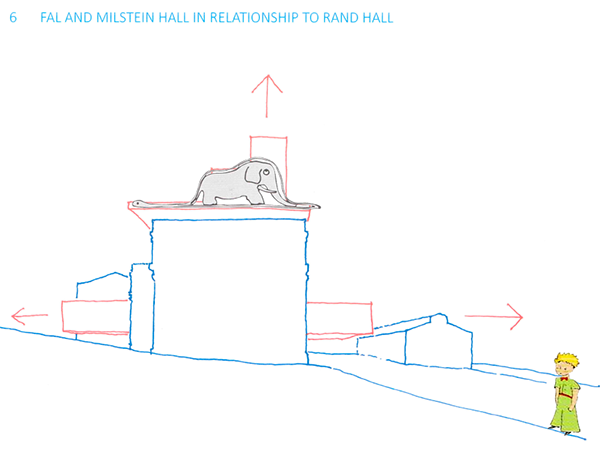
Fig. 11 My collage of the page 6 “lantern” diagram with the famous hat-vs.-“serpent boa” image from Antoine de Saint-Exupéry’s Le Petit Prince
Page 7. “4 levels of mezzanine shelving house the entire FAL collection, leaving generous spaces for reading and working. Upon entering immediate and clear overview of FAL-Collection. Dignified double-height reading room, similar to iconic historic and contemporary library buildings i.e. Bibliotheque St. Genevieve, new and old national Library in Paris, Academy of Fine Arts in Vienna…”
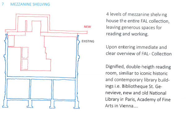
Fig. 12 Mezzanine Shelving. Image has been cropped to reduce size and some text has been enlarged for clarity
First, there are only two levels of mezzanine shelving, not four, with the other two levels counting as “stories” rather than mezzanines, and the whole thing being noncompliant with the 2010 Building Code of New York State for reasons explained in a prior post. Second, there is nothing clear about the “overview” one gets of the collection; rather, one is confronted with a puzzling mass of book stacks, far more confusing in form than the current organization of the “temporary” stacks. Third, what makes the double volume “dignified”? And by what stretch of the imagination is it similar to “iconic” buildings like the Bibliothèque Sainte-Geneviève?
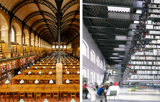
Fig. 13 Compare Henri Labrouste’s Bibliothèque Sainte-Geneviève, completed in 1850 (left) with the proposed Fine Arts Library (right)
Page 8. “…The mezzanine shelving, mainly used in book storages is a very economic means of storing books. A fusion of the economy of object defined book storage and generous user defined library spaces is proposed.”
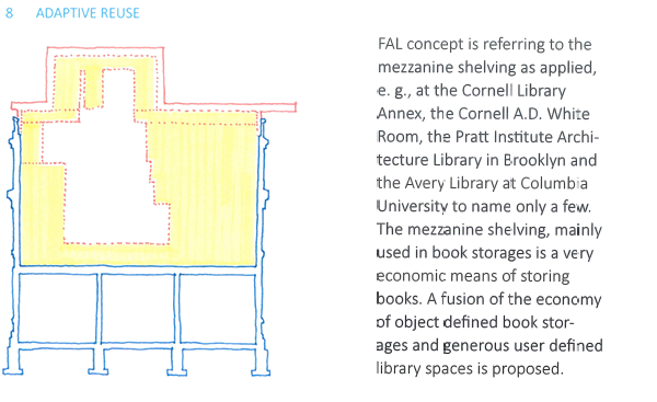
Fig. 14 Adaptive Reuse. Image has been cropped to reduce size and some text has been enlarged for clarity
Very “economic”? So if we demolish the perfectly adequate third floor and roof of Rand Hall, place incredibly expensive transfer girders spanning 45 feet from wall to wall where the roof used to be, meanwhile reinforcing at great expense what used to be perfectly adequate columns on the exterior walls and underpinning the foundations to deal with the newly-increased loads transferred from the transfer girders, and then hang several floor levels from these girders that, being disengaged from the original floor plates for which a new elevator was finally installed as part of the Milstein Hall project, require a second elevator to be inserted, and then—after so much money has been spent that the $6 million gift from a generous alumna doesn’t even begin to cover the project costs—buy relatively normal book stacks (aka “object defined book storage”), we are justified in characterizing this boondoggle of a project as “a very economic means of storing books”?
The page has the title, “Adaptive Reuse.” Is this some kind of a joke? Please just read the definition in Wikipedia and draw your own conclusions.
Page 9. The architects attempt to create a logical bridge between the utility of interior reading, working, and stack spaces, and the “high spatial quality” of their design.
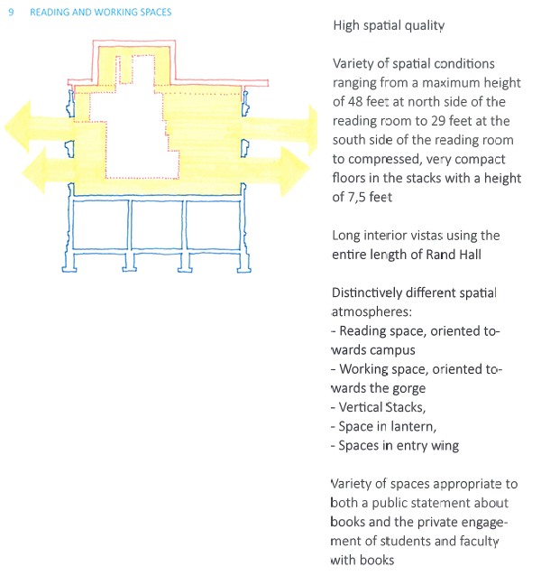
Fig. 15 Reading and Working Spaces. Image has been cropped to reduce size and some text has been enlarged for clarity
First, nothing in the design points to an understanding of how students and faculty actually use library space in the twenty-first century. As can be seen in the “artist’s rendering” posted by Cornell (Figure 16 below) or in the floor plans available in the Dean’s office at Cornell (but otherwise not made public), seating in the double-volume space is perfunctory and provides (1) no place for groups or individuals seeking moderate privacy, (2) no electric outlets for digital devices (please don’t tell me there will be floor-mounted receptacles), and (3) no white boards for sketching. Yes, I know there are one or two seminar rooms with undefined function, but there is nothing in the proposal that shows any awareness of, or interest in, what a twenty-first century library might consist of, what students, in particular, might find useful in such a space, and why students would want to “read” or “work” on little round tables where they have neither privacy, food, nor the ability to collaborate with other students.
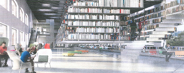
Fig. 16 Perspective rendering provided by Cornell shows perfunctory seating for “reading” and “working,” with no apparent interest in the two things that a twenty-first century library could actually benefit from: (1) informal collaborative spaces distinct from seminar rooms misleadingly labeled as “collaborative spaces”; and (2) food
Second, something called “high spatial quality” is supposedly created because one encounters a variety of vertical and horizontal dimensions—48 feet here, 29 feet there, 7.5 feet in the stacks, long vistas—as if quality can be explained on such a basis. Retreating just a bit, the architects then pick a more neutral word instead of quality: atmosphere. But even here, they define “different spatial atmospheres” not by spatial qualities, but by orientation, e.g., with “reading space, oriented toward campus” (by which they must mean East Avenue) or with “working space, oriented towards the gorge” (by which they must mean University Avenue). It’s not clear what distinguishes “working” from “reading” space—perhaps “working” in this library means using the library’s iMacs rather than one’s own laptop or tablet. Why, in a world increasingly defined by wireless connections to portable devices and the digitization of visual resources, are we being asked to believe that a library featuring—get ready for this: books and computers!—represents some sort of insight into the role that such spaces might play in the university’s (and college’s) future? Stuart Brand, in How Buildings Learn, answered this question is 1994:
Schools of architecture… are wonderful and terrible. Wonderful because they foster the last great broad Renaissance-feeling profession, terrible because they do it so narrowly. They focus obsessively on visual skills such as rendering, models, plans, and photography. Sight substitutes for insight. The artistic emphasis discourages real intellectual inquiry, diverting instead into vapid stylistic analysis…[emphasis added]
Having invested so much money into deforming a perfectly flexible and adaptable building into something that can only be one thing—a big double-volume space with hanging stacks of books—it will require another huge expenditure of money for the college and university to fix this mistake.
But back to the text: it is hardly clear why students who are “reading” would prefer to look down University Avenue, directly into the southern sun, while students who are “working” would prefer to look across University Avenue. In fact, none of the students shown in the renderings seem aware of their orientation towards one or the other street, being absorbed in their “work” or “reading.” The “orientation” arrows in the diagram are entirely specious. What would be useful instead are solar arrows demonstrating the futility of doing anything productive on the southern side of this solar greenhouse. Yes I know that, as in Milstein Hall, one can always buy expensive curtains or blinds to compensate for the spatial conditions advertised as being the organizational basis for the scheme.
How are these spaces “appropriate to both a public statement about books and the private engagement of students and faculty with books”? These are all mindless assertions, or archispeak (“high spatial quality,” “different spatial atmospheres,” spaces that are “appropriate” as “public statement” and for “private engagement”) that have no evidentiary underpinning. In fact, what the space seems designed to do best is simply to exhibit itself.
Pages 10-11. The north “working” spaces have “diffused natural daylight conditions and long views towards the gorge.” The “lavish south reading space” also has “natural daylight.”
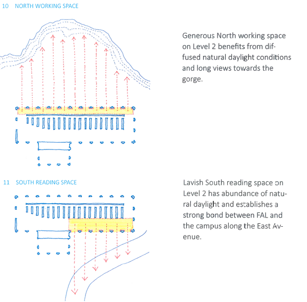
Fig. 17 North Working Space (p.10); South Reading Space (p.11). Image has been cropped to reduce size and some text has been enlarged for clarity
I won’t comment on the alleged “strong bond” established “between FAL and the campus.” What is remarkable is how these two pages are devoted to natural lighting on the north versus the south edges of this building, and yet not a single useful statement is made about potential problems, or mitigation measures, arising from the building’s southern and eastern exposures. Nothing is said about the low eastern light in the morning that affects both the “reading” and “working” spaces or the intense southern light that creates glare and heat gain in the “reading” zones. And nothing is said about the library’s evening and night hours when there is no natural daylight, diffused or otherwise. Electric light fixtures are neither discussed nor shown in any of the renderings. Does the whole basis of the library’s internal organization (orientation) suddenly disappear during evening and night hours?
Page 12. The plan diagram shown is of the second floor, yet the text describes “Mezzanine shelving galleries [that] are always open-ended, providing long perspective views South across the campus and librarians offices, West- into Milstein Hall Studio space and East- towards the Thurston Bridge.”
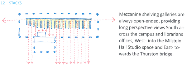
Fig. 18 Stacks. Image has been cropped to reduce size and some text has been enlarged for clarity
First, how can there be “open-ended” galleries with views “[s]outh across campus and librarians offices”? The librarians offices actually block these so called open-ended views. Defining “blocked by the wall of an office” to mean “open-ended” is rather Orwellian. Second, of the four stack levels, none of the mezzanine floors have views into the Milstein Hall studios (only the second floor level does). Furthermore, looking west from the second floor mezzanine, all one sees is the mechanical room unceremoniously placed on what was Rand Hall’s third floor (now being redefined as the second-floor mezzanine level) in order to bring conditioned air into Milstein Hall. Third, are the architects really taking credit for “providing long perspective views”? Do they not understand that perspective arises because of well-known geometric principles activated within our own perceptual apparatus (in which light emanating from the three-dimensional world passes through a small lens in our eye and is projected on our retina), and not because of some design that may or may not have parallel lines of walls or book shelves.

Fig. 19 Albrecht Dürer’s canonical illustration of the geometric basis of perspective, from The Painter’s Manual, 1525
Page 13. A page supposedly about “collaborative spaces” shows two yellow plan areas, only one of which might actually be a collaborative space (but is better characterized as a “seminar room”).
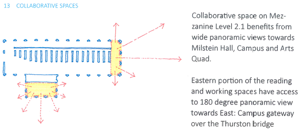
Fig. 20 Collaborative Spaces. Image has been cropped to reduce size and some text has been enlarged for clarity
Why this room, isolated from the main library space, “benefits from wide panoramic views” is not clear. Does this mean that collaboration is more effective because one can look out of windows in three directions? Or simply that this space in Rand Hall happens to have windows facing in three directions and any programmed use in that room would equally “benefit” from the views? And in what sense is this a collaborative space? It’s actually programmed as a seminar room, and so will not necessarily be available for spontaneous use by groups of students. The other highlighted space is just part of the double volume at the eastern end of the building and has nothing to do with collaboration.
Page 14. Another collaborative space is highlighted, this one in the “lantern” on the top floor.
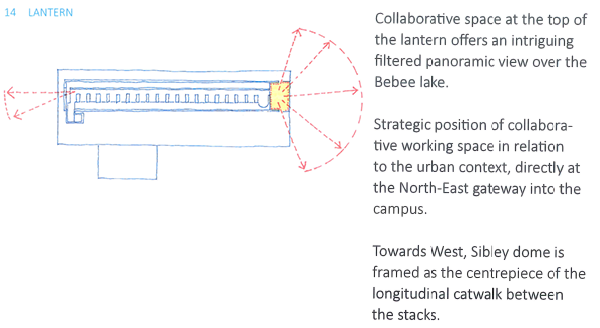
Fig. 21 Lantern. Image has been cropped to reduce size and some text has been enlarged for clarity
I’m not sure what a “filtered panoramic view” means: perhaps the windows are treated in some way to minimize solar gain and glare, which “filters” (obstructs?) the view.
Page 15. This diagram shows a “relationship” of “special volumes.”

Fig. 22 AAP Volumetric Relationship. Image has been cropped to reduce size and some text has been enlarged for clarity
What’s clear from the alternate “massing” image taken from OMA’s Milstein Hall web page (see Fig. 23 below) is that Tschapeller’s characterization, or abstraction, of a useful massing strategy for the AAP buildings is entirely arbitrary and self-serving. In fact, OMA’s Milstein Hall design was intended to provide the required “gateway” from North Campus; do we now need another “gateway” to the original “gateway”?
Fig. 23 Comparison of Tschapeller’s Rand Hall “gateway” with OMA’s Milstein Hall “gateway”
[Update Aug. 12, 2015] Before Rand Hall suddenly, somehow, needed to serve as a “gateway,” Milstein Hall was proudly advertised as having already accomplished this programmatic goal :
Milstein Foundation: “Milstein Hall, at the nexus of the central and north campuses, serves as a gateway structure that perfects one of Cornell’s key entrances. As such, it is having the same catalyzing effect on the Cornell campus that Milstein development has had in New York City.”
AAP News: “Irma Milstein, a Cornell parent, committed $10 million to Cornell in 1999 for a building creating a distinctive gateway to the campus. At the time, Irma and Paul’s son Howard was active on the Cornell Board of Trustees.”
ArchDaily: “The insertion of Milstein Hall amongst the existing AAP buildings forms a new gateway for the northern end of Cornell’s campus and transforms together with the recently completed addition to the Johnson Arts Museum an underutilized area into a new corridor for the arts, planning and design.”
American Institute of Architects: “The insertion of Milstein Hall among the existing AAP buildings forms a new gateway for the northern end of Cornell’s campus and, together with the recently completed addition to the Johnson Arts Museum, transforms an underutilized area into a new corridor for the arts, planning, and design.” (Notice how this 2013 quote is essentially identical to the 2011 ArchDaily description above.)
Architectural Record: “An enormous steel-truss structure that stretches 195 feet by 170 feet on its second floor and cantilevers 50 feet over University Avenue to the north, it creates a new gateway to this part of campus and orients the architecture school to views of Fall Creek Gorge. So Koolhaas may talk big about playing quietly, but his building certainly makes itself heard.”
Cornell Daily Sun: “Thanks to last year’s $10 million gift to the College of Architecture, Art and Planning, plans to provide AAP students with a new state-of-the-art facility as well as a new gateway to Cornell’s campus are well underway.”
Emphasis added in the quotes above. What’s clear from all this is that the idea of a “gateway” is more than a bit overblown and self-serving. [end of 8/12/15 update]
Page 16-17. On page 16, we read that putting something new on top of something old “allows for a clear distinction line between the existing and the new.” On page 17, we read that this “clear distinction” ought to be made ambiguous by “suggesting” the continuity of the brick facade above the parapet using mirror tricks.

Fig. 24 The Existing Versus the New (p. 16); Reading of the Canopy as Part of the Cornice (p.17). Image has been cropped to reduce size and some text has been enlarged for clarity
Making a distinction between “old” and “new” is apparently a reaction to the Secretary of the Interior’s Standards for Rehabilitation, which state that:
9. New additions, exterior alterations, or related new construction… shall be differentiated from the old and shall be compatible with the massing, size, scale, and architectural features to protect the historic integrity of the property and its environment.
This is the same standard cited in the defense of Milstein Hall’s aggressive massing in relationship to the Foundry building, and is clearly so subjective and ambiguous that it can be cited to defend pretty much any intervention. What is not mentioned, of course, are the following propositions from the same document:
1. A property shall be used for its historic purpose or be placed in a new use that requires minimal change to the defining characteristics of the building and its site and environment.
2. The historic character of a property shall be retained and preserved. The removal of historic materials or alteration of features and spaces that characterize a property shall be avoided.
5. Distinctive features, finishes, and construction techniques or examples of craftsmanship that characterize a property shall be preserved. [Think industrial sash windows, for example.]
After all that, to broach the idea of visually extending the brick facade into the space of the new lantern (thereby compromising the lantern’s ability to be perceived as something “new”) by reflecting its image in the canopy soffit—at least from the point of view of someone pretty much directly under the canopy, looking up—is nothing short of bizarre.
Page 18. The so-called “canopy,” a new overhanging roof extending primarily on the south and east sides of the building, is described as a “technical necessity.” Why? Because it “helps protect the existing facade by reducing the exposure to moisture runoff on the brick masonry” and because it “helps to shade the large scale windows.”
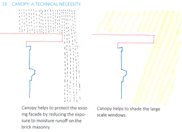
Fig. 25 Canopy: A Technical Necessity. Image has been cropped to reduce size and some text has been enlarged for clarity
But does the canopy actually do anything significant to reduce wind and sun exposure? A substantial percentage of wind during the rainy seasons in Ithaca comes from the north and west—precisely the locations where the canopy does not extend beyond the brick facade and would therefore have no effect on the exposure of the brick to wind-driven rain. But what about sun exposure on the south and east, the two facades where the canopy extends beyond the brick line. As can be seen from my solar diagram (Figure 26 below), the southern sun at noon at the height of summer in Ithaca has an altitude angle of approximately 70 degrees which is reduced to approximately 48 degrees on September 20 at noon. What this means is that even when the canopy is most effective (noon at the summer solstice), only the third-floor southern windows are shaded; by September 20 at noon, none of the southern windows are shaded. Of course, at all other hours—say 10 am or 2 pm—the sun is lower in the sky and so even this minimal amount of shading is reduced. And the eastern canopy is completely useless since the morning sun is low in the sky all year long. In other words, the “technical necessity” of the canopy is a complete fabrication and bears no relationship to reality.
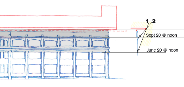
Fig. 26 My solar diagram shows that maximum shading, during the summer solstice at mid-day (line 1) only shades the third floor windows, while no shading is provided at all by mid-September (line 2)
Page 19-20. Comparing the existing building, on the one hand, and the proposal with the east stair tower removed on the other hand, claims are made about “re-establishing the urban relationship of Rand Hall in its setting, as well as the architectural integrity of the building.” However, three things were deliberately left out of the photoshopped proposal photo (or is it an archival pre-stair-tower image?): 1) the gridded industrial sash windows, which give the building much of its “character,” are shown as if they have been salvaged rather than removed; 2) the historically sensitive “lantern” (pardon my sarcasm here) is not shown; and 3) two new egress doors which destroy the integrity of existing ground floor windows on both the south and east facade, and which became necessary when the architects decided to remove the perfectly adequate east stair tower, are not shown. But more importantly, what on earth is meant by the “urban relationship of Rand Hall in its setting”? And even if there were such an “urban relationship” on this rural campus, why—at this awkward intersection of East and University Avenues—would either the existence or removal of a stair tower make any difference? In other words, the East Stair Tower is hardly a major issue one way or the other, as these recent site photos indicate.
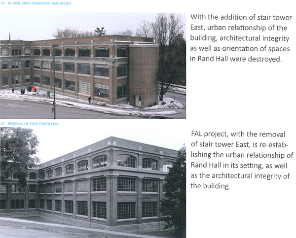
Fig. 27 In 1968, Stair Tower East was Added (p.19); Removal of Stair Tower East (p.20). Image has been cropped to reduce size and some text has been enlarged for clarity
One last point: To demolish a perfectly useful and innocuous egress stair that has been attached to Rand Hall for virtually half of its life, while simultaneously destroying the integrity of the original building structure (removing the roof and third floor slabs), replacing its characteristic industrial sash windows with modern insulated glass, busting through the south and east facades at the ground level to provide emergency egress doors that violate the rhythm and pattern of the masonry openings (and that would otherwise not have been needed), and adding a visually anomalous hat (“lantern”) over the existing cornice line, all the while claiming that these moves re-establish the “architectural integrity of the building,” is rather incredible.
Pingback: Rand Hall’s East Stair Tower | Jonathan Ochshorn
Concerning Milstein Hall… the process to discern the college’s programmatic needs, to choose potential architects, to ‘finalize’ the architectural choice (and ‘re-finalize’…), etc seemed to be quite a lengthy process. With the schematic design of the FAL transformation, what is the impetus for ‘one architect’ being chosen for such an expensive project? Was there an internal competition, or a short list ?
I have worked with Wolfgang when he was visiting Cornell last Spring, and he is an intelligent and passionate creative. From my perspective, it appears that the architect (while not entirely, as many of the mistakes you bring up are hard to forgive) may be working on an extremely expedited schedule for a project of this scale.
I enjoy reading your architectural critiques, as they are very thorough and come with a voice not often heard in Cornell Architecture critiques (both academic and institutional). That being said, in this series, as well as your writing on Milstein Hall, you seem quick to write off architectural inadequacies as incompetence/ignorance on the architect’s end, when many of the problems seem to stem directly from the institution’s requirements and directives. Personally, I am not surprised that the process goes in the direction that it does (Cornell is, after all, very concerned with its ‘reputation’), but from your end I frequently detect a tone of bewildered disbelief: “how could the architect be so blind to the building code and everyday needs!?” If Cornell wanted a solid building, they would have gone to Zumthor, to Ensamble, etc. They obviously want icons, so Mayne Rem and Wolfgang don’t come as surprises to me. This isn’t a groundbreaking realization I hope…
If a suit handed me a check for $30m and said he wants to be remembered as making a difference, I think I would have a difficult time focusing on the mullion details.
Ok I think that’s it for now
I can try to answer some of your questions and respond to some of your comments:
As far as I know, Cornell has only sponsored one competition to find an architect: this was for Milstein Hall and was won by Steven Holl Architects (although it didn’t work out in the end; another firm was hired and fired before OMA/Koolhaas finally got the job). In the case of the Fine Arts Library, there was a Committee that presumably discussed the library’s goals and formulated some sort of program, but I don’t know the details: Cornell itself has a process in place [this pdf is from 2006 and I’m not sure if there is a later version] for identifying potential architects, interviewing them, creating short lists, and so on. At the end of the lengthy description of the process are these “sample consultant selection criteria”:
You’re correct when you state that “many of the problems seem to stem directly from the institution’s requirements and directives.” Cornell is certainly complicit, as I’ve written over and over again (see, for example, my response to AAP Dean Kleinman’s letter to the Architect’s Newspaper). On the other hand, it is the architect that submitted a 100% Schematic Design proposal, and the architect must also take full responsibility for what his proposal says.
I disagree with your interpretation of my “tone” as one of “bewildered disbelief.” In fact, I have written extensively about the reasons that architects create building failures (see, for example, Designing Building Failures; A Probabilistic Approach to Nonstructural Failure; and Architecture’s Dysfunctional Couple: Design and Technology at the Crossroads”> — it is hardly a surprise to me that architects create bad buildings, and my writings on Milstein and Rand Halls simply present the evidence in a straightforward (not a “bewildered”) manner.
You state that if “Cornell wanted a solid building, they would have gone to Zumthor…” In fact, Zumthor’s submission as part of the Milstein Hall competition was absolutely terrible in the way it locked the program into a series of non-adaptable concrete boxes (although it therefore was very “solid”). But yes, Cornell seems to want these little curios produced by image-conscious architects. This attitude originates with the leadership of Cornell, extends to the Office of the University Architect, and is validated by many of the faculty in the Architecture Department.
Pingback: Comments on Ho Fine Arts Library: A Body of Books | Impatient Search